

Role: Interaction Designer
Team: 1 Design Lead, 1 Designer, 1 User Researcher, 1 Prototype Developer
Timeline: March 2022 - June 2022
Results: An innovative web & mobile ad format for SMBs targeting local customers, featuring a map and auto-generated video, that feels 18% less cluttered to users.
Note: All advertiser information and Google Maps data shown below are mock assets.
Helping Small and Midsize Businesses Attract Local Customers
- Small and Midsize Businesses (SMBs) generally rely on foot traffic to meet their annual revenue goals.
- SMBs often have smaller advertising budgets than their larger competitors and lack the marketing resources to create high-quality advertisements.
The Google Display Ads (GDA) organization recognized this need to help SMBs advertise to local customers through the use of Google Maps integrations and Auto-generated Videos (AGV).
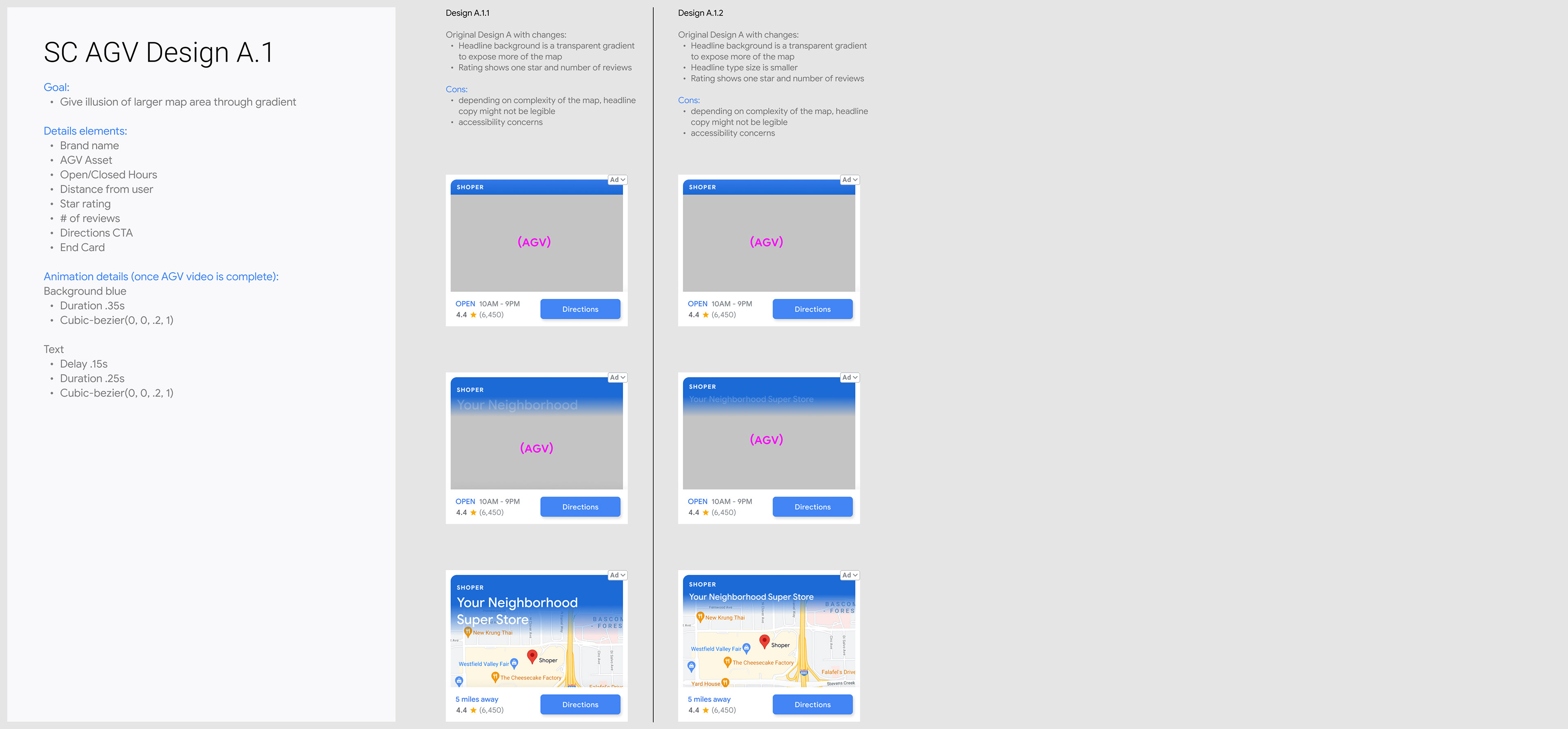
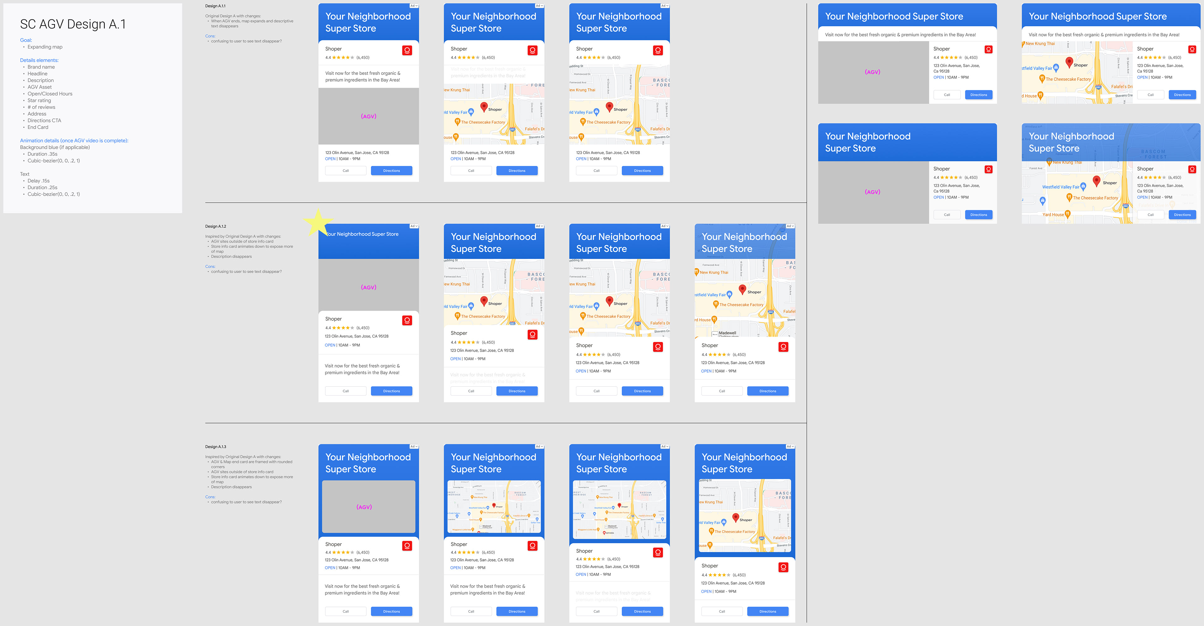
The First Attempt: Design V1
- For years, GDA has been running ads that integrate with Google Maps for local shopping campaigns.
- GDA has recently experimented with AGVs: videos that are automatically produced based on assets inputted by the advertiser (such as logos, slogans, and product images).
The following design was the lead designer's first attempt at integrating Google Maps and AGVs. In the three designs shown below, an auto-generated video would play once the user scrolls over the ad. Once the AGV concludes, it will fade to expose a map of the local business.
Square design for web
Interstitial portrait design for mobile
Interstitial landscape design for mobile
User Research: Round 1
We presented these ads to a focus group in the context of an online blog. User researchers followed up with questions about the ad experience.
Key Insights:
- Users prefer when the map is large and detailed.
- Users quickly recognize local landmarks, such as big box stores or main roads, and understand that this ad is local to them.
- Users increase trust and engagement when they see an association with the Google brand.
- Users were attentive to the video and appreciated that it presented information sequentially.
Hypothesis
Enlarging the map size will result in increased user comprehension, trust, and understandability while lowering user confusion about the ad format.
For this controlled experiment, we focused on increasing the size of the map. In future iterations, we can experiment with highlighting different landmarks to determine what map information is most salient to users. Beyond that, we can experiment with editing the content and pace of the AGV.
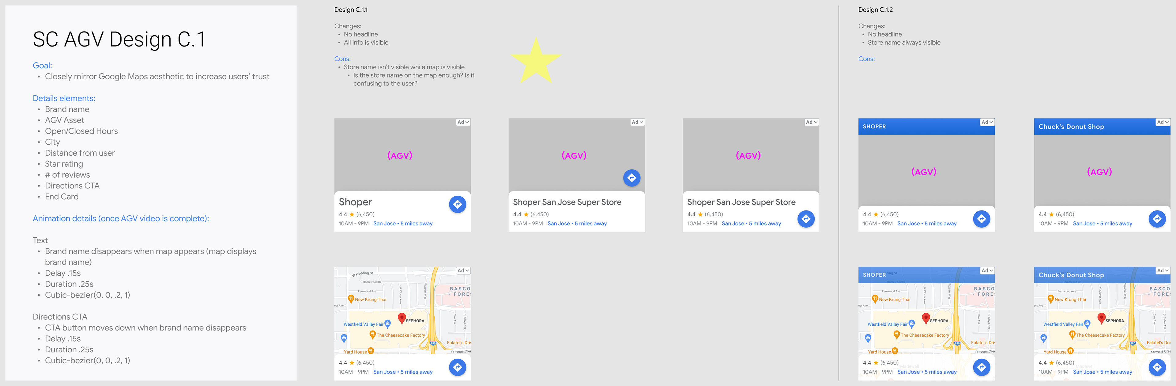
The Second Attempt: Design V2
This is where I took over the design process. I began iterating on the original design given our key insights from user research and our new hypothesis.
Here's a peek into my design process...
Square Format Explorations
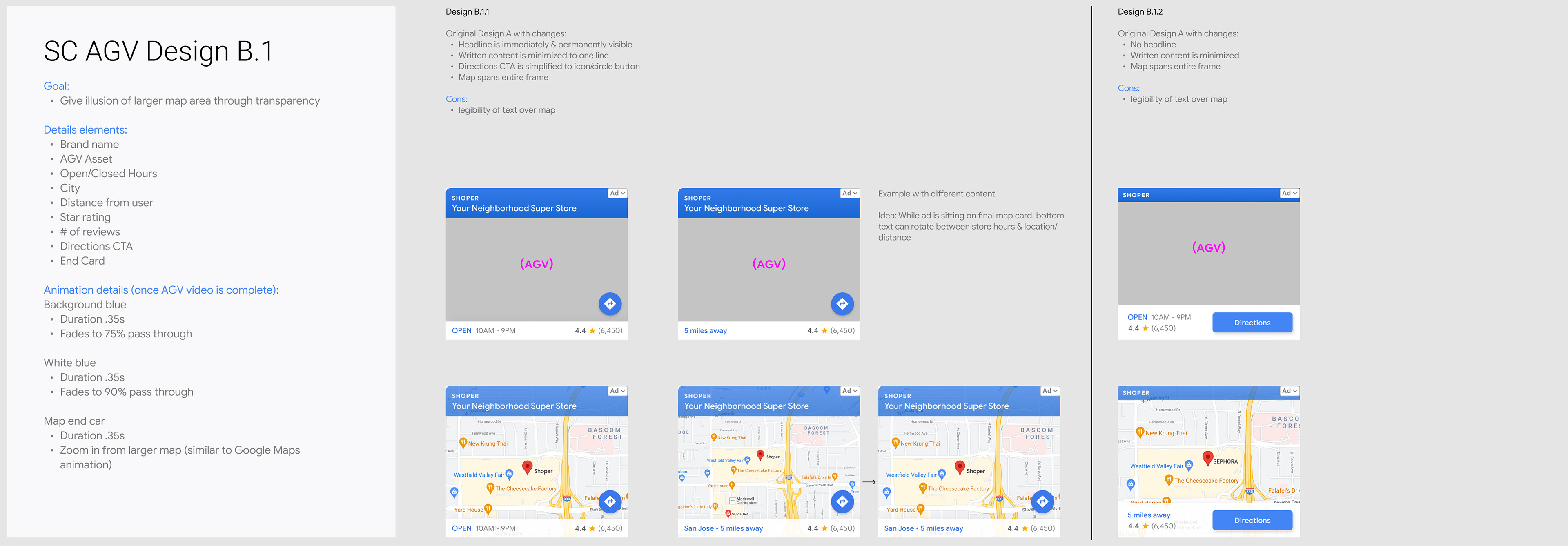
Interstitial Format Explorations

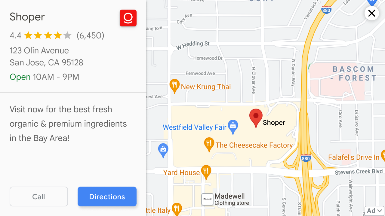
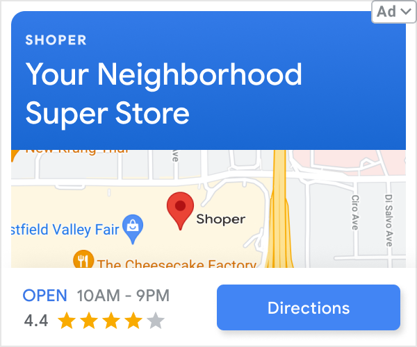
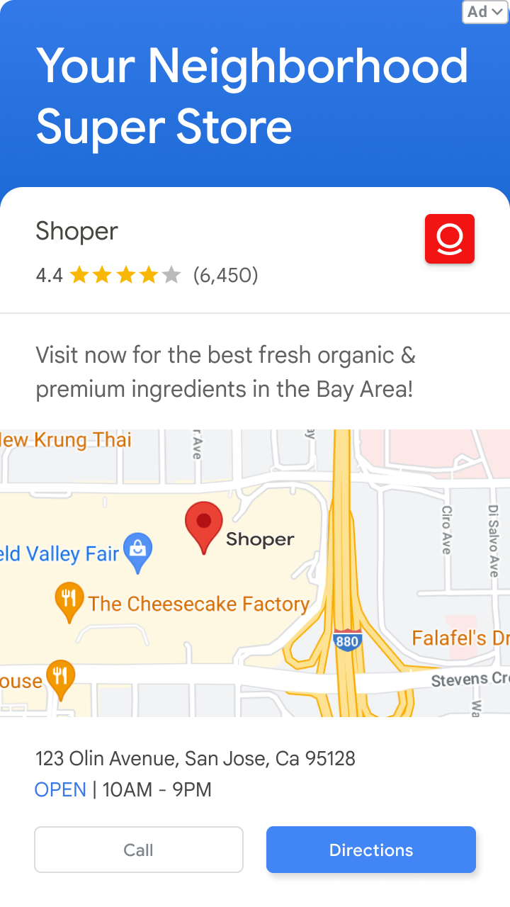
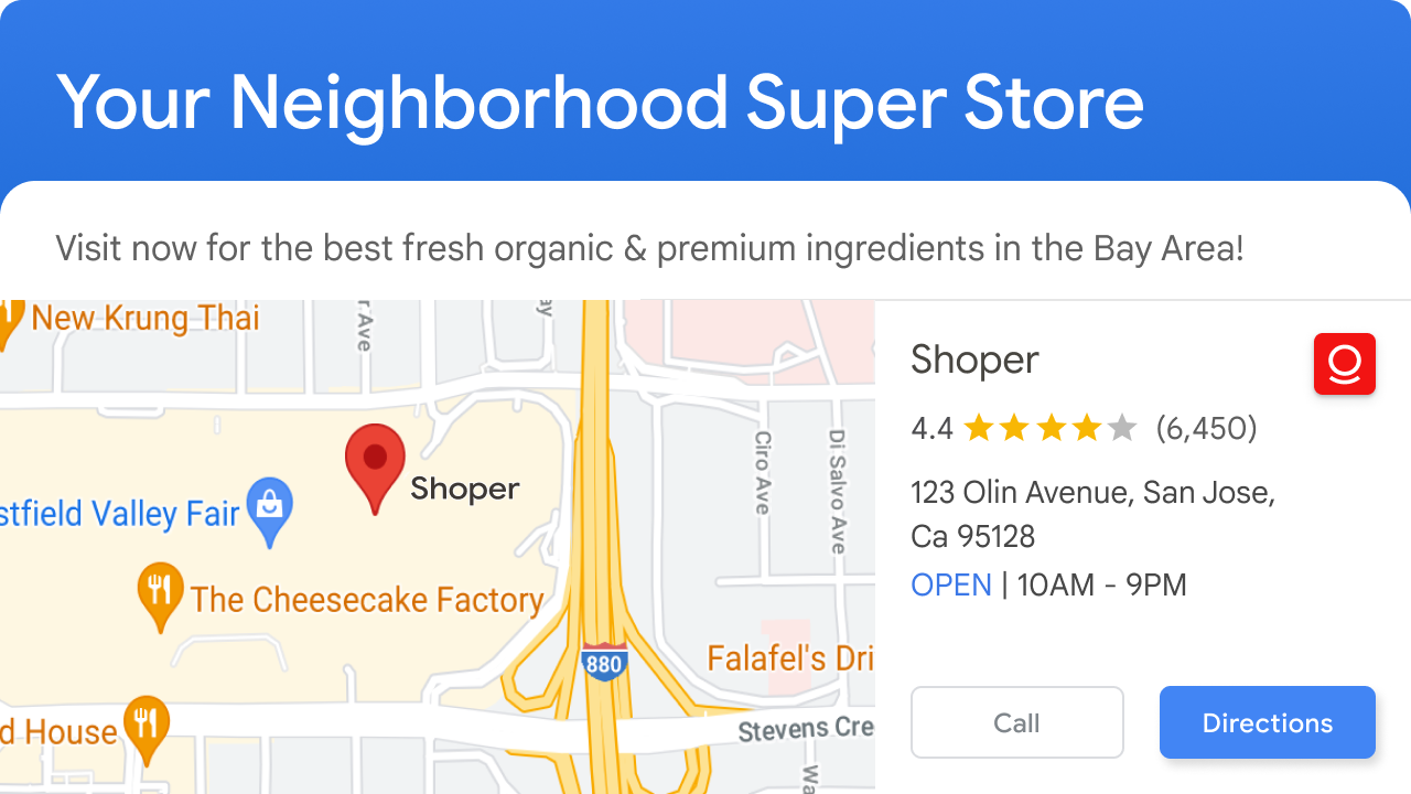
Final Design
After many iterations, a few rounds of feedback from our design studio, and a lot of stress testing, I landed on a new ad format design for SMBs running local shopping campaigns.
- To make space for an enlarged map, I removed the headline to expose more ad surface area.
- While the AGV plays, the blurred map is visible in the background, informing the user that this is a local ad.
- I consolidated the marketing copy so it is easy to read.
- I borrowed from the Google Maps design system so the ad format elements appear similar to a Google Maps business page to increase familiarity and trust with the user.
Square design for web
Interstitial portrait design for mobile
Interstitial landscape design for mobile
User Research: Round 2
We conducted another format evaluation to determine if this refreshed ad format improved user sentiment and validated our hypothesis.
Users reported that the ad felt 18% less cluttered, slightly less distracting, slightly less confusing, slightly less scammy, slightly more visually appealing, slightly more discoverable, slightly more modern, and slightly more understandable.
This was a positive iterative improvement for this ad format!
Next Steps
Now that we have achieved a layout that feels less cluttered and easy to understand, we can focus on the information we are presenting.
Refining the map details: Users appreciated when they saw recognizable landmarks, such as big box stores and main roads. We can modify the Google Maps data so it shows the most salient information to the user and removes any distracting noise.
Editing the content and pacing of the AGV: There is so much to experiment with in the AGV, such as text, images, motion, and graphic elements. We can develop different storylines and determine what is most informative and delightful to users.

